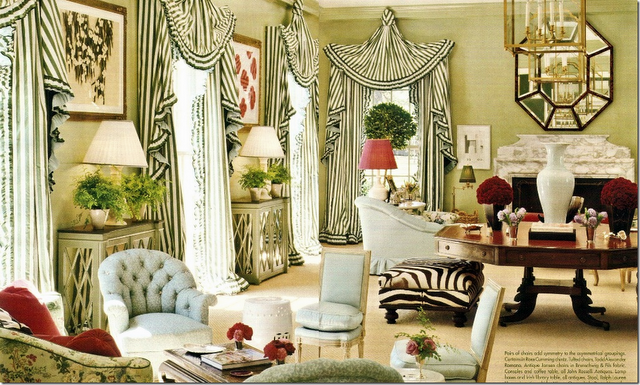
2011 was a very interesting decorating year and today I'd like to take a few moments to review a few less-than-successful designs created over the last 12 months.
Right: Faces on Tarot cards might be interesting but not in a foyer.
Source: Room Service
Source: A Lovely Being
Silhouettes date back hundreds of years and are charming - but, not as wallpaper and not in a bathroom. Can you imagine seeing this first thing in the morning?Source: House Beautiful
Bohemian meets Aunt Clara of Bewitched? There are few specific elements of this decorating scheme that I like - the lamps, the mirror, the round end table, and the antique dresser. But, a low ceiling looks lower when wallpapered - you definitely don't want to bring attention to the height of this room. And don't get me started on the Purple Crush tufted sofa with mix-and-unmatched chairs. Just NO. Source: House to Home
Okay, you know where this is going. MAYBE I could have tolerated the purple Moroccan valance and drapes if the headache-blue wallpaper wasn't included. Probably not.Source: Metropolitan Home
A martini is the only place where you should find an olive
in this room - definitely NOT on the wall!
Source: Miles Redd Interior Design
NO. Just a huge NO.
If you walked into a sophisticated apartment and saw a swing hanging from the ceiling in the middle of the living room, what would you think? Either the owners are too lazy to take their kid to the park or they're just kinky.
Believe it or not, wallpaper featuring life-sized outdoor views was popular in the 1970s. The trend should have stayed there. (I'm worried the cat will get confused.)
You're puzzled, aren't you? You're wondering, "Why would she include this benign, pleasant room on her Decorating Fail List?" Take a look at those unacceptable window treatments - too small, too old fashioned, too boring. If you're brave enough to throw a zebra rug on the floor, take a risk with the windows, too.
What's my gripe with this room? It's too safe. And, I'm a little put off by the chair covered in a fabric that matches the sofa instead of a complimentary fabric. Why is that curtain covering up one of the few interesting architectural elements in the room?
Source: Room Service
Where do I start? The magenta animal skin tufted ottoman? The hideous modern art hanging over the concrete-looking sofa? The outdated enamel lamps? It's hard to believe that a decorator actually put their name and reputation on this project. The wood paneling is beautiful and I think I would have made the rug the focal point of the room. Just sayin'.Thanks for putting up with me as I vented about some Decorating Fails. Tomorrow - Decorating Successes!


No comments:
Post a Comment