Today we're going to start out with a re-do for the tykes in the audience.
Remember when you were little and you wanted your own special chubby hole?
that is as darling as it is unique:
Before: After:


What little buckaroo wouldn't love to have his own
private barn?!
~~~~~~~~~~~~~~~~~~~~~~~~~~~~~~~~~~~~~~~~~~~~~~~~~~~~~~
Before: File this under Fail
After: so Attractive!
~~~~~~~~~~~~~~~~~~~~~~~~~~~~~~~~~~~~~~~~~~~~~~~~~~~~~
It's not just the unusual shade of grape
that is a little off-putting, this bathroom
was just too dated:
LOVE the neutral colors and the wood trim:
~~~~~~~~~~~~~~~~~~~~~~~~~~~~~~~~~~~~~~~~~~~~~
Before:
Lanterns like the two on the left can often be found
at local Habitat for Humanity thrift stores at ridiculously
low prices .
It's amazing what a simple spray paint job can do, isn't it?!!
After: Whether used indoors or out,
these lanterns are now so fleaChic!
Before: not many of us would give this old
outdoor light fixture a second glance.
By replacing the electrical wiring with a candle and
painting the brass you now have a beautiful centerpiece.
After: charming!
~~~~~~~~~~~~~~~~~~~~~~~~~~~~~~~~~~~~~~~~~~~~~~
The over-sized neon advertising sign transformed a staircase landing office into a chic hangout.
~~~~~~~~~~~~~~~~~~~~~~~~~~~~~~~~~~~~~~~~~~~~~~~~~~~~~~~~
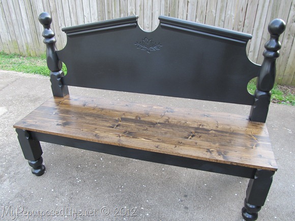
The next time you spot a twin bed with a foot board
at a thrift shop, consider turning it into a bench:
~~~~~~~~~~~~~~~~~~~~~~~~~~~~~~~~~~~~~~~~~
Beautiful rehab of a bedroom chair:
The damaged vanity was divided into two precious bedside tables:
~~~~~~~~~~~~~~~~~~~~~~~~~~~~~~~~~~~~~~~~~~~~~~~~~~~~~~~
With a little sanding, a paint treatment and molding, this dresser was repurposed into
a darling nursery changing table:
Inspiration comes in all shapes and sizes and often
involves a little elbow grease!


Wow...nice work.
ReplyDeleteI write and maintain a blog which I have entitled “Accordingtothebook” and I’d like to invite you to follow it.
Thank you for following my blog! I'm following you right back. I enjoy before and after projects. Great inspiration you've featured here.
ReplyDeleteHave a wonderful Easter weekend!
Tammy
I was wondering if you ever considered changing the page layout of your website?
ReplyDeleteIts very well written; I love what youve got to say.
But maybe you could a little more in the way
of content so people could connect with it better.
Youve got an awful lot of text for only having one or 2 pictures.
Maybe you could space it out better?
my page: payday loan lenders direct