I always feel that February gets short-changed with only 28 days. Leap Year provides us with an extra day this month so let's get motivated with some Before and After photos and put that gift to good use.

Thrift stores and yard sales abound with elegant but outdated chairs. Rosemary at Villabarnes transformed this darling chair with a simple paint treatment and linen upholstery.
Prepare yourself for one of the most amazing Before and After projects ever featured on fleaChic.

Such vision - this
plain little lamp
is now amazing!
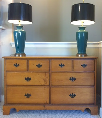
Not only did Rashon do an amazing job on the dresser below, he also upcycled the lamp shades.
After:
The chair and footstool below were crying out to be rescued.
Classic pieces might need a touch-up but they never go out of style:
Source

We're going to play a new game: What I Like About This Scheme

Thrift stores and yard sales abound with elegant but outdated chairs. Rosemary at Villabarnes transformed this darling chair with a simple paint treatment and linen upholstery.
Here is a distressed little stool that Rosemary transformed with the use of paint and stencils:
There's no 'before' photo of this little stool but isn't it precious?
Prepare yourself for one of the most amazing Before and After projects ever featured on fleaChic.
Before:
Wingback chairs from Goodwill priced at $14.99 each
After:
This project was accomplished with paint! Yes, fabric paint!
Rashon Carraway, blog author of Mr. Goodwill Hunting, is the self-proclaimed King of Thrifting. Rashon is an Atlanta based decorator who devotes his talents to renovating and restoring furniture from thrift stores for his clients.
Rashon has been featured on national television, most recently on Nate Berkus' design show. Here are just a few more examples of his incredible talent for the re-do:

Such vision - this
plain little lamp
is now amazing!
Not only did Rashon do an amazing job on the dresser below, he also upcycled the lamp shades.
Before:
After:
So classy!
Most of us would probably have walked right past this sofa and not given it a second glance:
Beautiful results, Mr. Goodwill Hunting!
The chair and footstool below were crying out to be rescued.
Classic pieces might need a touch-up but they never go out of style:
Source

We're going to play a new game: What I Like About This Scheme
Take a few minutes to study the photo below then mentally list the things that stand out to you. Consider the layout, the colors, the mood of the setting. What are your initial feelings when you look at this photo?
A room without a fireplace or a large statement piece needs a focal point. For me, the focus of this design is on the collection of framed sketches. The neutral wall color provides a balanced backdrop for the art and isn't in conflict with the many colors and textures of upholstery and accent pieces. Several different stains and styles of natural wood furniture were used but the mixture is charming and inviting. My rating for this room: B+ (mainly because I can't see the window treatment). What are your feelings?
A room without a fireplace or a large statement piece needs a focal point. For me, the focus of this design is on the collection of framed sketches. The neutral wall color provides a balanced backdrop for the art and isn't in conflict with the many colors and textures of upholstery and accent pieces. Several different stains and styles of natural wood furniture were used but the mixture is charming and inviting. My rating for this room: B+ (mainly because I can't see the window treatment). What are your feelings?


No comments:
Post a Comment