Whether it's celebrities, fashion, gourmet food, or even dogs, publishers and editors regularly crop photos to enhance the subject matter and accommodate space limitations. Interior designs are no different - but the Before & After shots can be amazing:
Oh, my - is this the same room?! The
photo on the left doesn't even hint at
the glory of the beach-inspired loft below.
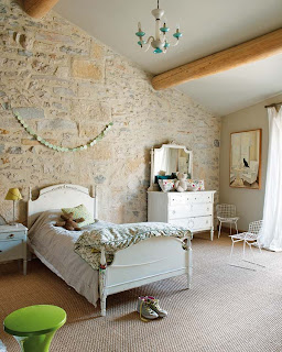
Had the owners of this 17th century European home not exposed
the hand-hewn stone and beams, the bedroom would have looked
like this:
Oh, my - is this the same room?! The
photo on the left doesn't even hint at
the glory of the beach-inspired loft below.
Had the owners of this 17th century European home not exposed
the hand-hewn stone and beams, the bedroom would have looked
like this:
Instead of this:
Would you have guessed that the shot below was taken in a loft?
When it comes to space and layout,
editors have to make tough choices.
By expanding this shot the designer gave a
completely different perspective to the room:
An unremarkable homely homey, little cabin kitchen:
until you see the entire picture:
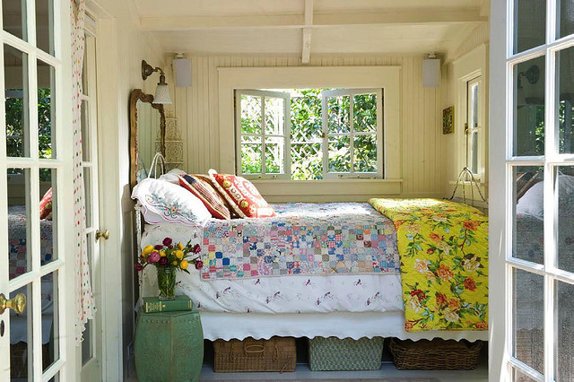
Would you have guessed that
this sweet bedroom is . . .
. . . . actually a small porch?!
A perfectly charming library . . . . .
. . . . with a reading loft.
This photo actually ran in a decorating magazine:
Too bad they cropped the whole picture:
I hope you enjoyed this fun insight into photo
editing. You might just look at design shots
a little different in the future.
Special thanks today to:


I was suggested this web site by my cousin. I'm not sure whether this post is written by him as no one else know such detailed about my problem. You are incredible! Thanks!
ReplyDeleteAlso visit my web-site ... cash advances payday loans